Understanding Your Wellness Dashboard
After each 3D body scan, your results are organised into a wellness dashboard - a single view of your measurements, tracked across every session. This article explains how the dashboard is structured, how to read it, and how to use it.
What the dashboard is
The wellness dashboard is not a health report. It does not diagnose, assess clinical risk, or replace any conversation with a medical professional. What it does is give you organised, longitudinal data about your own body - the kind of granular, consistent information that is rarely available outside a clinical or research setting, and that becomes more useful the more scans you complete.
Your data is grouped into seven domains, each representing a distinct dimension of body composition or structural health. Within each domain, individual metrics are tracked from your baseline scan forward, so every result sits in context rather than in isolation.
For a detailed explanation of what each individual metric means, how it is derived, and what the reference ranges represent, see the companion article: A Guide to HeraVita's Wellness Indicators →

The seven domains
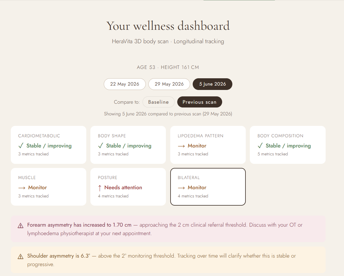
Your dashboard organises measurements into seven domains. Each tile on the summary screen represents one domain, showing its current status and the number of metrics being tracked within it.
Waist circumference, waist-to-hip ratio, and waist-to-height ratio — three established proxies for central adiposity and associated metabolic markers.
Body roundness index, conicity index, and ABSI — indices that describe how fat is distributed across the body in three dimensions, beyond weight or BMI alone.

Waist-to-thigh and waist-to-calf ratios, tracked over time as indicators of lower-body fat distribution. Relevant for women monitoring or investigating a lipoedema diagnosis.
Body fat percentage, fat mass, lean body mass, total body water, and basal metabolic rate — derived from scan measurements using validated estimation formulae.

Calf, and mid-arm circumferences, assessed against established reference thresholds. Calf circumference is used as a proxy marker in current sarcopenia screening guidelines. ↗ AWGS 2019
Shoulder asymmetry, neck-shoulder-point height difference, trunk-to-leg ratio, and leg-length asymmetry — metrics that describe structural alignment and proportion rather than composition.

A comparison of paired limb circumferences - upper arm, forearm, thigh, and calf - to detect asymmetry between the left and right sides of the body. Asymmetry between paired limbs can be relevant for a range of conditions affecting fluid distribution or limb volume, and is tracked longitudinally against established referral thresholds.

Reading the summary tiles
Each domain tile displays one of three statuses, based on where your metrics currently sit relative to their reference ranges and recent trend direction.
| Stable / improving | Metrics within this domain are either unchanged or moving in a direction consistent with reduced risk or improved composition. No action is indicated. | |
| Monitor | One or more metrics are in a range that warrants attention across subsequent scans. This is not an alert — it is a flag to watch the trend as your data accumulates. | |
| Needs attention | A metric has crossed a threshold the dashboard treats as clinically significant. This is a prompt to raise the finding with a relevant health professional — not a diagnosis. |
A single measurement tells you where you are. A trend tells you where you are going.
Comparing scans: baseline vs previous
At the top of your dashboard, you can toggle between two comparison modes.
Shows how your current results compare to your first scan. Useful for understanding the overall arc of change across the full study period.
Shows what has changed most recently — between your last session and the one before it. Useful for identifying short-term shifts that may not yet register against baseline.
Both views are useful, and neither supersedes the other. A metric might show little change from baseline while the previous-scan comparison reveals a recent shift worth monitoring — or vice versa. Reading both gives a more complete picture than either alone.
The trend is the data
Beneath each metric panel, a trend chart plots your result from baseline forward across every scan you have completed. These charts are where the dashboard's longitudinal function becomes most visible.
A waist circumference of 72 cm means relatively little in isolation. The same figure, read alongside a prior measurement and a direction of change — and held against stable lean body mass — tells a more specific story. Individual numbers are reference points. Patterns across multiple scans are evidence.
The dashboard becomes more useful with each scan you add. Early results establish your personal baseline. Subsequent scans reveal whether your metrics are stable, improving, or shifting in a direction worth discussing with a health professional. The value of longitudinal tracking compounds over time.
How to read an alert
When the dashboard generates an alert, it appears below the summary tiles with a brief explanation of what has been observed and why it has been flagged. Alerts are triggered by one of two conditions: a metric crossing a predefined reference threshold, or a rate of change between scans that warrants monitoring regardless of absolute value.
An alert is not a finding. It is a prompt - an indication that this metric is worth raising with your GP, specialist, or relevant allied healthcare professional at your next appointment. The alert note will indicate which type of practitioner is most relevant to the domain concerned.
Bringing your dashboard to a health appointment gives your clinician additional context: not a single number, but a documented pattern of change across multiple time points. That distinction is often what makes a conversation more productive.
What the dashboard cannot tell you
The dashboard works from surface measurements derived from 3D scanning. It does not measure internal organ fat, arterial health, bone density, hormonal status, or any marker requiring blood analysis or imaging. The indices and ratios it reports are proxies, validated associations between external measurements and underlying health dimensions, not direct assessments of those dimensions.
Where a metric falls outside a reference range, or where an alert is generated, the appropriate response is professional consultation. The dashboard is a tool for self-knowledge and structured monitoring. It is not a substitute for clinical assessment.
The HeraVita wellness dashboard is provided for body awareness and longitudinal self-monitoring only. It does not constitute medical advice, clinical assessment, or diagnosis. No measurement, metric, ratio, or alert should be used to alter, delay, or replace any medical treatment or professional health consultation.
If you have concerns about any result shown in your dashboard, consult your GP or relevant specialist. Reference thresholds cited within the dashboard are drawn from published clinical guidelines and are used for monitoring purposes only - they do not establish clinical diagnosis.
Leave a comment
Add a comment